 It might be a sign of increasing age, but these days I prefer the quieter Tate Britain to the glitz and gargantuism of Tate Modern. Last weekend we went there early to see the retrospective of the sculptor Rachel Whiteread. Most of the works are shown together in a single undivided room and there weren’t too many other people there to get in the way of a good hard look at the works, and how they connect to one another.
Rachel Whiteread may be one of the few Young British Artists puffed by Charles Saatchi in the 1980s whose work will withstand the passage of time. Why should that be? There are three reasons, I think. Very early on she hit upon her distinctive style-cum-subject, the casting of the empty space defined by common objects. She’s kept true to the idea ever since. As you can see by walking around the Tate’s big room, it gives her work a solidity and integrity that’s rare among contemporary artists.
 Second, the capture of ‘empty space’ is a theme pregnant with possibilities, and Whiteread has explored many variations on it over the years. If as an artist you’re going to take as your starting point a ‘concept’ – a doubtful idea, since there’s no reason to expect visual artists to be the philosophers of their age – then it’s best to choose one that’s rich enough to sustain repeated treatment. Whiteread’s is a notion that goes back to the beginnings of philosophical thought. Plato, in his Republic, attacks artists, banishing them from his ideal state on the grounds that what they do is to make false ‘copies’ of the material world. Since the material, physical world, according to Plato, is itself an unreal, illusory ‘copy’ of the truth, artists – deluded fools – are working at two removes from reality. Artists like Whiteread might reply that what they’re trying to do is to use copies to find a ‘sort cut’ to the transcendent truths so dear to Plato.
More recent philosophers have emphasised philosophy’s role in examining and untangling the conceptual puzzles, many of them of linguistic origin, that we habitually tie ourselves up in. Whiteread’s casts are visual analogues of such conundrums. You can spend a long time gazing at her white casts and trying to figure out what they actually ‘embody’ (itself a paradoxical term when they reproduce air or water, not static things). Looking at them is hard on the brain.
 But memorialising ‘empty space’ opens many paths to the imagination, too. The power of the idea was obvious early. What made Whiteread a public name was her first work on a large scale, House (1993). It cast the interior of a whole abandoned house in London. The local council’s immediate demolition of the work, to public outrage and protest, was an almost perfect critical comment on it. It summarised in a single swing of the wrecking ball House’s theme of a space emptied of lifetimes of living and caught only for a moment of time.
 Absence, Loss and Time are the three Whiteread muses, and they wander through almost all her casts. What occurred to me, though, scanning the works as a whole, was that the power of their spell varies from one to another. The most powerful pieces are those that transcend the simplicity of the underlying concept. This is the third of the keys to Whiteread’s success. Meticulous in their technique, the casts explore the mundane thinginess of the spaces they copy: the tiny mechanisms of door locks, the echoes of sagged mattresses, the resemblance of the interior of a hot water bottle to a human torso. Another way Whiteread gives energy to inert, abstract space is to use exotic materials as her casting medium. In the hall outside the room the curators have reassembled a large work from 1995, Untitled (One hundred spaces). This is a collection of casts of the air underneath chairs, arranged in a grid. The casts are made of resin, and each is different, in texture and in colour. Their colours, yellow, oranges, red and blue, seem to glow, lit by mysterious interior lights. Together, these cubes almost hum with a quiet energy, stored maybe from the lives of the chairs’ sitters.
 Rachel Whiteread’s greatest work, it seems to me, is her Holocaust memorial in Vienna, a rectangular construction in the form of an ‘inverted, impenetrable library’, installed in the Judenplatz in 2000 after much trouble and distress to the artist. Only a maquette and photograph are on show in the Tate, but two related works are here: Untitled (Room 101) (2003), a cast of the room in Broadcasting House that was George Orwell’s model for the torture chamber in 1984, and three ranges of ‘bookshelves in reverse’, devoid of books (only their ghosts remain). Room 101 recalls the terrifying closed-in-ness of the Vienna piece. The shelves echo the extinguished books that line the four faces of the Holocaust memorial – a reference to the The Book of the Jewish people and in general to the culture and civilisation negatived by the Nazis.
Later, wandering round the permanent collection of Tate Britain, we found ourselves in the room devoted to work made around the time of the First World War. Close to a bronze relief of battle by Charles Jagger that I was already familiar with was a small painting I’d never noticed before. It was by Walter Sickert. As a rule I feel a natural affinity with fellow Walters – Walt Whitman and Little Walter come to mind – but I’ve always thought Sickert a dull painter. His grim preference for browns and greys make it seem as if his eyes see the world through a permanent London smog. His subjects, too, are deliberately drab, and often sexually dubious (he was addicted to prostitutes, personally and artistically).

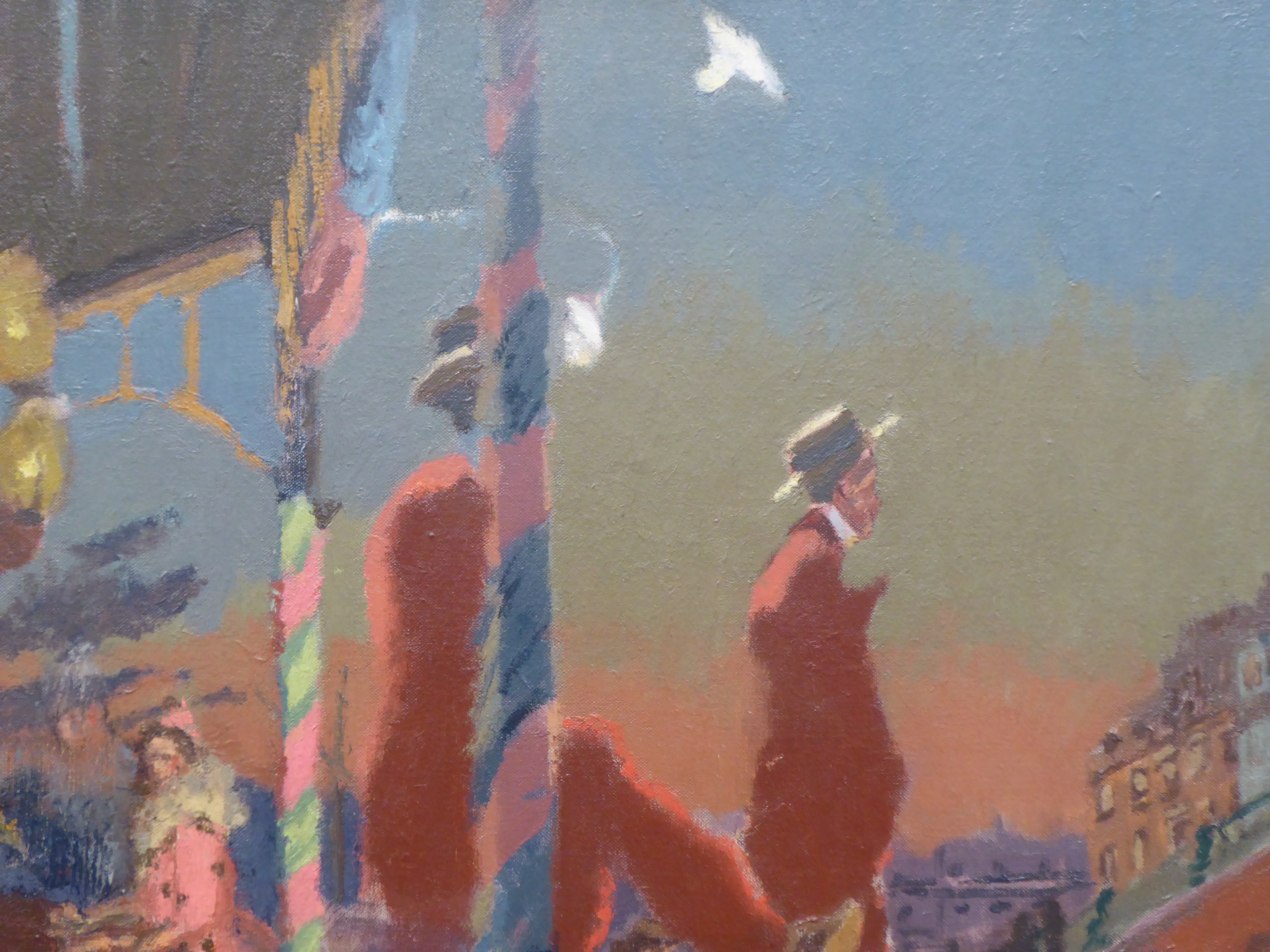
This painting, though, is quite different. It’s called Brighton Pierrots. It’s late summer 1915, and Sickert has escaped the murk and fleshpots of London and come to the seaside. A temporary wooden stage has been built on the beach, and on it a troupe of ‘pierrots’ is performing (singing, dancing and acting). At the front are two men, both dressed in maroon suits and wearing straw boaters. Beyond them a woman in a bright pink frock, a pierrette, plays a piano, and other actors sit at the back, waiting their turn. It’s the very end of the day: on the horizon an orange glow lingers, below a blue, then yellow sky, and stage lights highlight the columns wrapped in multicolour streamers and the backs of the men’s suits and hats. To the right are the tall terraces of the Brighton seafront. Below the stage front are deckchairs, only a few of them occupied.

It’s a strange picture. The lighting gives it a spooky, unreal air. Sickert’s choice of viewpoint, from the right-hand side of the stage, is also odd. His composition is strongly reminiscent of Degas, whom he knew: the way the nearest man’s body is awkwardly cut by the column is very similar to Jockeys before the race, a bold picture, now in the Barber Institute, Birmingham, which Degas painted in 1878-79. Degas, too, of course, was strongly attracted to the stage as a setting for his work.
The performance looks half-hearted, as if the actors are just going through the motions and can’t wait to be able to leave the stage, get out of their clothes and have a drink. A contemporary critic of the painting wrote that ‘these poor abraded butterflies of the stage appear half-immaterialised, and with a glamour that is theirs but for this short moment’. Any lack of enthusiasm on their part might be forgivable, because there are hardly any spectators in view. It’s late in the day and late in the season, and in any case there’s a war on.
 By the later summer of 1915 it was becoming clear the war would be very long and costly. Casualties mounted quickly after the beginning of the Battle of the Somme on 1 July. Brighton was not far from the fighting, and the sound of the big guns in Flanders could sometimes be heard on the south coast of England. The war seems to cast a shadow of melancholy over what should be, to judge by the theme and Sickert’s bright, even garish, colours, a scene of fun and frivolity. In pencil sketches he’d included many figures watching in their deckchairs; their absence in the painting must be deliberate, and depressive. It’s known that Sickert was downhearted by the war, fearing for the safety of Dieppe, across the Channel, which he knew and loved from his annual summer visits up to 1915. In one letter he wrote, ‘the war constipates my heart & my pen’.

Nicola Moorby compares Brighton pierrots with Mark Gertler’s more famous painting of 1916, Merry-go-round , a fairground ride with screaming faces, an ‘entertainment metaphor’ for the cruel, relentless march of war and killing. Sickert’s treatment is less explicit, although his painting does feature a more obvious image not remarked on the critics. In the sky are two white birds, almost certainly doves. One of them descends in a spiral – surely a symbol of the loss of peace and life.
The pierrot was an almost clichéd symbol for sadness among artists of the period. Sickert himself had sketched Woman and pierrot embracing in 1901. Pierrot figures are common in Picasso from around 1900, and later in the paintings of Georges Rouault.
The melancholia of loss is a theme, maybe, that unites Walter Sickert with Rachel Whiteread, an artist who otherwise seems to share very little with him. Her means of dealing with absence and loss is rooted in her core technical practices rather than in the choice of subject matter and style. But in truth they are universal concerns for artists, whatever their age and tradition.
Leave a Reply to Sian Evans Cancel reply