
The Trump administration has just opened a new front in its intensifying war on the rest of the world. It’s a typographical war, and it concerns a common font called Calibri. Personally, I’m quite fond of Calibri, and use it pretty much every day of the week. But, from the perspective of the Trumpists, it has a problem. A woke problem.
To explain, Calibri is a sans-serif font, invented in 2002-4 by a gifted Dutch type designer, Lucas de Groot, who described it as having ‘a warm and soft character’. Its popularity increased after Microsoft adopted it as its default font in Windows 2007, where it supplanted Arial. Most people are happy to accept it as an everyday font. It’s simple, handsome, easy to read and has few drawbacks, other than that the lower-case letter L (‘l’) is indistinguishable from the upper-case letter i (‘I’).

In 2023 the US Department of State decided to switch from using Times New Roman, the venerable serif font it used previously – it dates back to 1931 when it was designed under the direction of the pioneering typographer Stanley Morison for use in The Times newspaper – to Calibri. The reason was that Calibri was shown to be much more readable on a computer screen. In particular it was much more easily understood by text-to-speech and optical character recognition software, and therefore aided accessibility for those unable to read conventional text.
This month, however, Marco Rubio, the Secretary of State, decreed that the State Department would abandon Calibri and revert to using Times New Roman. A spokesperson said that the change would help ‘present a unified, professional voice in all communications’ and ensure ‘our communications reflect the same dignity, consistency, and formality expected in official government correspondence.’

This official rationale gives the impression that Rubio’s decision is based only on a preference or taste. But there’s clearly more to it. His choice of language makes it clear that ‘reversion’ is good in itself. It aligns with MAGA dogma, which is all about returning the US to its presumed former state of greatness (when it was, it seems, entirely white, Christian, industrial and old-fashioned). By contrast, progressive change is by definition execrable. What’s more, the swap to Calibri happened during the detestable Biden era (damnatio memoriae being a prime Trump meme).
And there’s another factor. Rubio also said that another reason for the abandonment of Calibri was to ‘abolish yet another wasteful DEIA program’. DEIA stands for Diversity, Equity, Inclusion and Accessibility’. This quartet of values, of course, is widely accepted in most of the world, in helping to build a more equal and fairer society, but of course to the Trump mind it’s anathema. Any government policy that seeks to promote them needs to be stamped out. So Calibri’s role in helping government documents become more accessible to all US citizens is automatically suspect.

In most respects Times New Roman is equally as simple, handsome and easy to read as Calibri. And we’ve had centuries to get used to serif fonts (a serif is, Chambers Dictionary tells us, ‘a short decorative foot at the end of a stroke on a printed character’) – arguably, ever since Aldus Manutius asked Francesco Griffo to create them for the pocket versions of the Greek and Roman classics he published in Venice around the end of the turn of the sixteenth century.
Nonetheless, different fonts do seem to carry different ideological charges, at least in the US. An American psychological researcher, Katherine Haenscher, has shown that serif fonts seem to appeal more to those of conservative leanings, whereas liberals tend to prefer more informal sans-serif types. Organisations seeking to influence the political or social views they communicate with seem to be aware of this general rule. So they will, possibly unconsciously, use the font they feel is most appropriate to convey their views. A good example is The Times, the quintessential newspaper of the establishment, which still uses a variant of Times New Roman called Times Modern. The Daily Telegraph and the Daily Mail also go for serif fonts. On the other hand, though you might expect The Guardian to favour a sans-serif font, its use of sans-serif is actually very spare: most text is in serif (although serif of an understated kind).

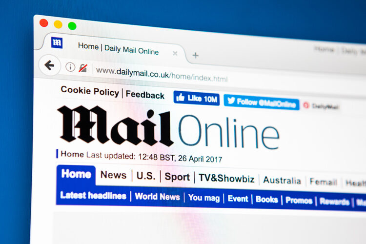
So maybe, at least in the UK, fonts are not quite so politicised as in the ultra-polarised US. It’s interesting, though, to note that the Mail and Telegraph still keep traditional Gothic or black-letter fonts for their masthead branding, an obvious badge (to me, at least) of their aggressively reactionary politics.
Maybe, though, in the UK fonts tend to be aligned to class rather than political allegiance? While the text-heavy printed Daily Mail keeps to its traditional serif font, its online sister, the celeb-gossip-snippet dominated Mail Online, uses sans-serif (its masthead has a weird mix of sans and black-letter). The Sun follows a similar pattern in its print and online formats.
Despite all this, though, font preference, it seems to me, is primarily a personal matter. Me, I’ll stick with Calibri for everyday, and serif for the blog – until my tastes change. As Microsoft’s did in 2023, when it got rid of Calibri in its Offices applications in favour of another sans-serif font, Aptos. As for Marco Robio, he probably has weightier wars to fight than typographical ones.
Leave a Reply