
Like a teenager, C. has fallen hopelessly in love, with a visitor from the Continent. I didn’t see it coming. And the worst thing is that I’m not sure it’s a temporary infatuation that will soon pass. It’s taken a firm hold on her affections. Only time will tell whether everything will end in tears.
I’m talking about Prussian Blue. It all started with buying a new tube. Up to now, other, commoner blues had been good enough. Prussian, though, belongs to another, superior class. For one thing, it’s quite expensive. More important, it’s quite unlike other, more superficial blues: its saturating tones contain depths that threaten to drown the eyes of the viewer. Once you’ve allowed Prussian to work its charms, it seems, there’s no looking back.
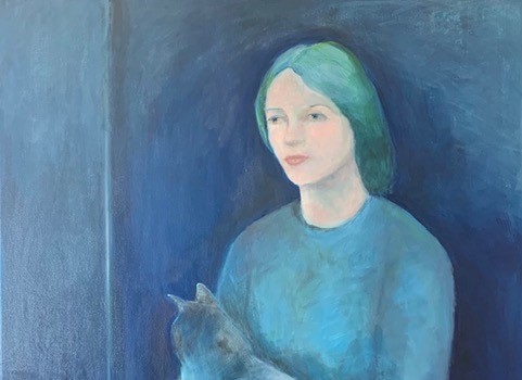
Already Prussian has taken possession of C’s palette. Her latest painting, Woman with cat, starts from a painting by Gwen John, but its blue, dark and profound, is far removed from John’s mild, restrained colours.

I’d not considered this before, but painters have always had a hard time with deep blue. The problem is the source of the colour. From around 2000 BCE the ancient Egyptians had a blue, now known as Egyptian blue, which they used on wall paintings, statues and furnishings. It was the very first synthetic (non-natural) pigment, and was made from silica, lime, copper and an alkali. But after the Roman period the secret of how to manufacture it was lost, until the nineteenth century.

Later painters used blues derived from indigo dye (from south Asian plants), smalt (cobalt glass), Tyrian purple (sea snails), and ultramarine. Ultramarine – ‘beyond the [Mediterranean] sea’ – is ground from the stone lapis lazuli, found in Afghanistan. All these had their problems: high production costs (extreme in the case of ultramarine), high import costs, or a tendency to fade over time, as in the case of smalt used on canvas. All this meant that blue from these sources was used very sparingly by early painters – only for the most important parts of the most important paintings or buildings, like the heavenly blue ceiling of the Scrovegni Chapel in Padua, painted in ultramarine by Giotto around 1305, or expensive works by Titian or Vermeer.
The coming of Prussian Blue changed that. The first pigment to be synthesised since the age of the Egyptians, it is manufactured by oxidising ferrous ferrocyanide salts. It seems that it was first made accidentally by a paint-maker called Johann Jacob Diesbach, with the help of Johann Dippel, in Berlin around 1706 – accidentally, because he was really aiming to make a red pigment as a dye, and used potash tainted with blood. Between 1708 and 1716 the new colour was the subject of correspondence between Johann Leonhard Frisch and the polymath, librarian and alleged biscuit inventor Gottfried Leibnitz, who was at the time President of the Prussian Academy of Sciences. Frisch published the first paper on Prussian Blue in 1710, and soon it was in use in many parts of Europe. Sometimes it was called Berlin Blue or Parisian Blue. By the nineteenth century its use was general: Hokusai’s famous woodcut print, The great wave off Kanagawa, contains large amounts of Prussian Blue.

Today, whenever painters search for the most intense blue possible, one that’s non-toxic and relatively insensitive to light, they’ll reach for Prussian Blue. It has a very complex chemical structure. The reason it’s so intense, apparently, is because electrons jump rapidly from low-spin Fe(II) ions to high-spin Fe(III) ions. Its high saturation means that it can’t be reproduced digitally on a computer screen (so don’t pay too much attention to what you see here).

Among the many painters who made extensive use of Prussian Blue were Watteau, Gainsborough, Van Gogh (Starry night) and Picasso (in his ‘Blue Period’ paintings). These were master of paint, but Michael Harding, an expert on oil paints, has a warning for the less expert, ‘if you don’t know how to handle it, the colour will creep into just about everything on your palette. It can be like painting with a nuclear weapon.’
Secularisation in art gave a push to the signification of blue. Instead of symbolising the grandeur of God, it came to stand as a marker for the darker human emotions – ‘the blues’. Or at least that’s the story. But maybe the truth is more complex. After all, the woman in Woman with cat is far from being a depressive: rather, the deep Prussian Blue of her dress and the background suggests a mood of calm reflection.
Leave a Reply